
Begin with an overview of FileCraft, emphasizing its mission to offer a wide range of file conversion tools and additional features like URL to QR code conversion, image background remover, text to audio conversion, case converter, and more. Highlight the challenge presented by the existing market: a saturation of ad-heavy, user-unfriendly platforms that fail to meet the needs of users like Amit, a designer looking for reliable, free tools.The aim was to cut through the clutter of ad-ridden, confusing websites and offer a sleek, one-stop solution.

I got involved in every part of the project. Starting with sniffing out the gaps in the market, I moved on to user research, chatting up potential users, and figuring out what they really needed. I was the bridge between the users’ wishes and the developers’ workbench, sketching out the user journey, creating mood boards, mapping out the site’s architecture, and drawing up wireframes. My hands were in everything: developing user personas, prototyping, and iterating until everything clicked.
The main hitch was the chaos in the current market. Too many sites were bombarding users with ads, making navigation a nightmare. People like Amit, a designer looking for simple, effective tools, were lost in a sea of poor choices. They needed something clean, accessible, and all-encompassing, without having to pay through the nose or jump from site to site.

We kicked off with identifying the problem, then moved onto the research phase, gathering insights through user interviews and surveys. After understanding our users’ needs, we dove into design, starting with wireframes and moving to more refined prototypes. Alongside, we kept testing, tweaking, and improving. The entire journey, from concept to launch, spanned several months, with continuous iteration even post-launch based on user feedback

Week 1: Research and Foundation Setting
Understanding User Needs – We kicked off by creating detailed user personas for FileCraft’s diverse audience, including students, professionals, and small business owners. Understanding these personas helped us pinpoint the most common use cases for file conversions and related tasks.
Engaging in User Research –Through targeted surveys and interviews, we dove deep into the behaviors and preferences of our users, focusing particularly on their experiences with file conversion tools. This enabled us to gather valuable insights into their pain points and needs.
Competitor Analysis – We conducted a thorough market and competitor analysis to identify gaps in the current offerings. This research highlighted opportunities for FileCraft to differentiate itself by addressing unmet user needs and improving upon competitors’ weaknesses.
Week 2: Design and Testing
Iterative Design Process – Armed with user insights and a clear understanding of the market, we led the UX design process from concept to prototype. This involved sketching out initial wireframes, developing them into interactive prototypes, and iterating based on feedback.
User Testing – We set up a series of user testing sessions to validate our design assumptions and gather feedback on our prototypes. This direct user input was crucial for refining our designs and ensuring they met the users’ needs effectively.
Finalizing Design Deliverables – With a refined design validated by user testing, we developed high-fidelity designs, comprehensive style guides, and detailed documentation
Collaboration and Handoff – In the final stages, we closely collaborated with the development team to ensure a smooth handoff. The comprehensive documentation and clear design specifications we provided guided the developers in bringing FileCraft’s revamped platform to life.

For competitor analysis, I looked at similar websites to see where they were falling short. Most were cluttered with ads, had confusing interfaces, and lacked specific tools users needed. I made a table comparing features, usability, and user satisfaction across these platforms, which clearly showed the opportunity for FileCraft to stand out.

Feedback from user interviews was gold. We learned that speed, simplicity, and reliability were top priorities. People were tired of navigating through ads and complex interfaces just to convert a file.
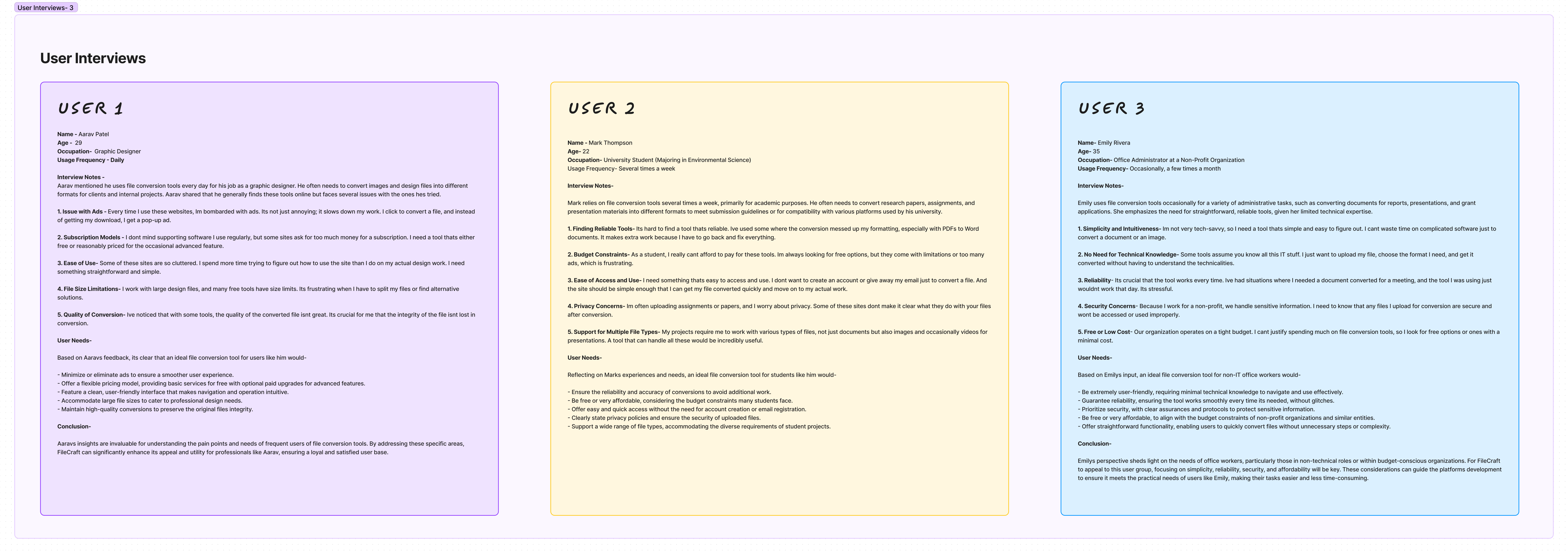
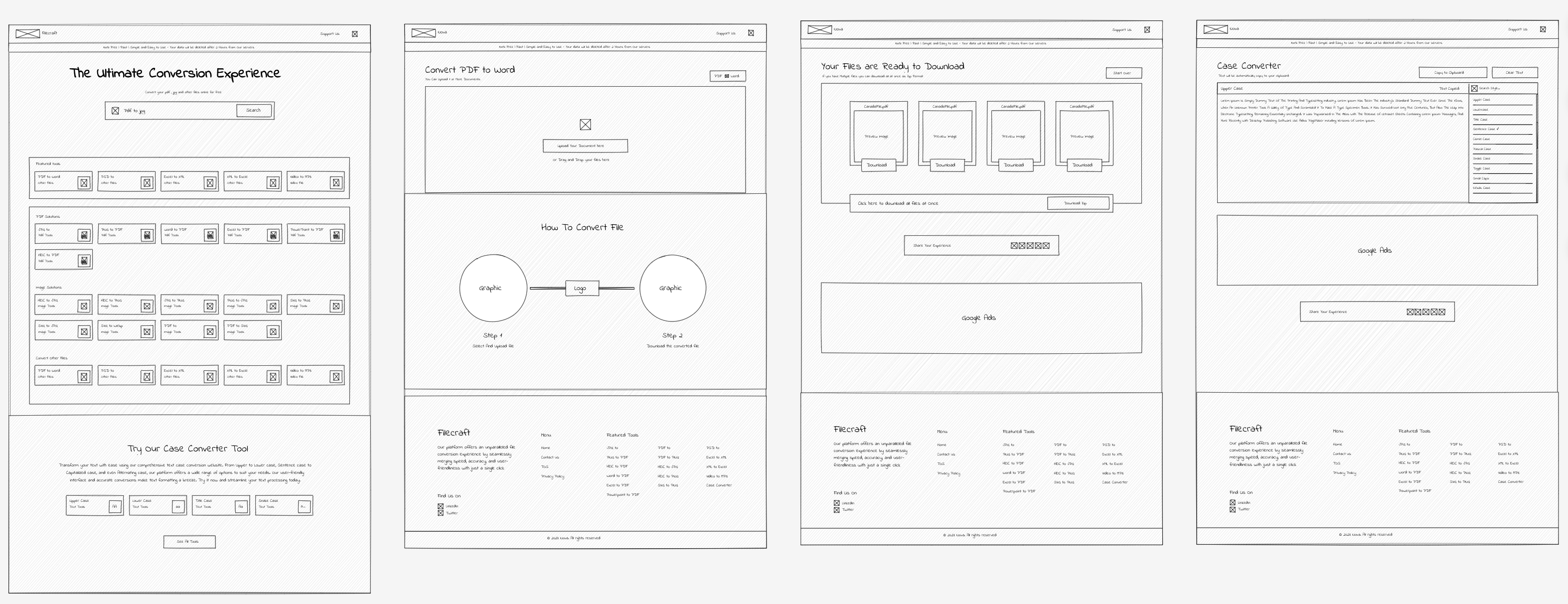
I began the design process using digital tools, sketching out the initial layout in software to quickly visualize the flow and placement of features. This approach allowed for immediate adjustments and facilitated collaboration with the team.

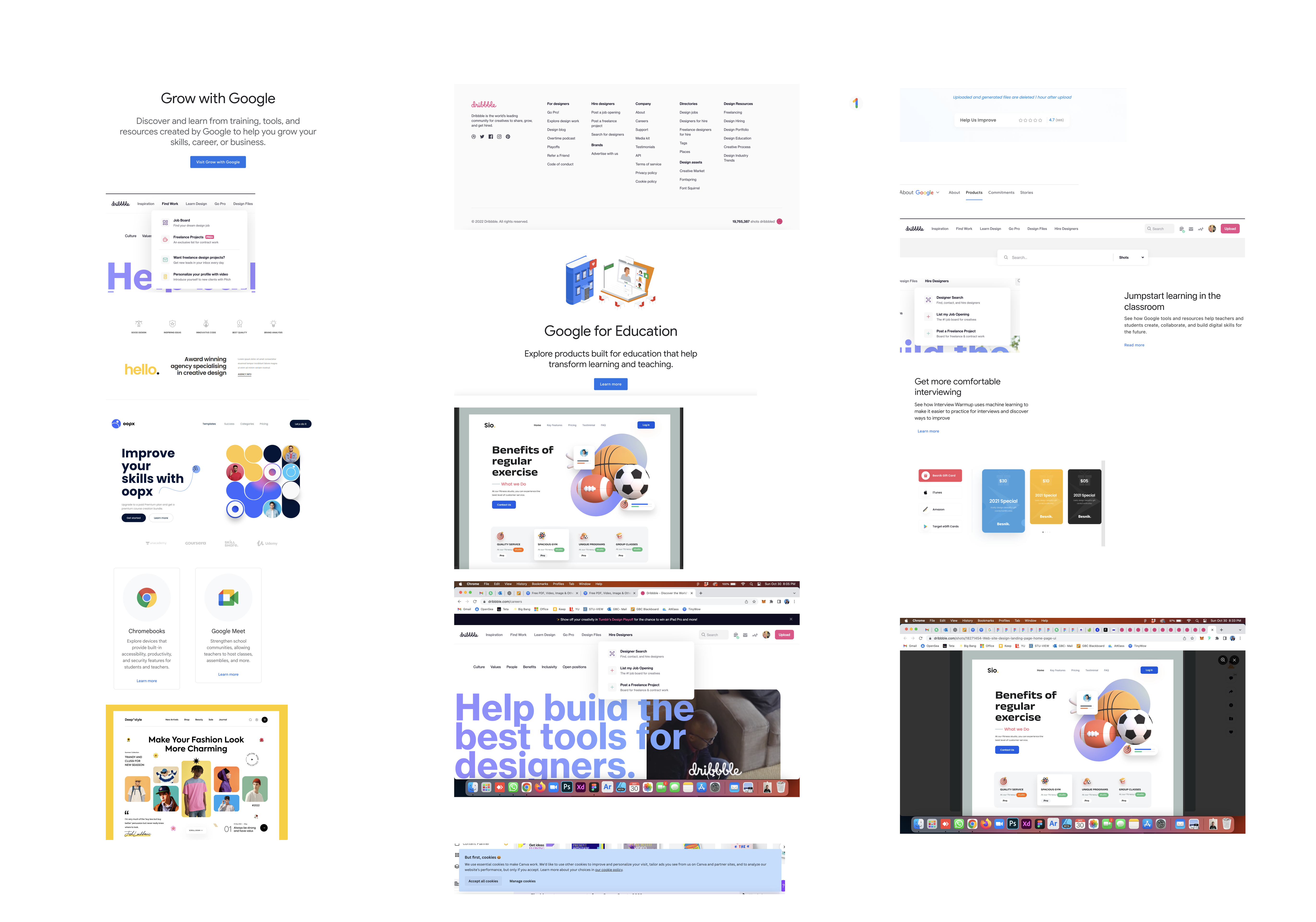
We began by exploring a wide range of websites, design forums, and digital product showcases. Our focus was on identifying elements that resonated with the core values of simplicity, efficiency, and user friendliness, which are central to FileCraft’s mission. We paid particular attention to platforms celebrated for their intuitive UI/UX design, innovative features, and elegant visual appeal.
In building the UI for FileCraft, we focused on crafting user-friendly elements and a clean layout, ensuring each component enhances usability and aesthetic appeal.
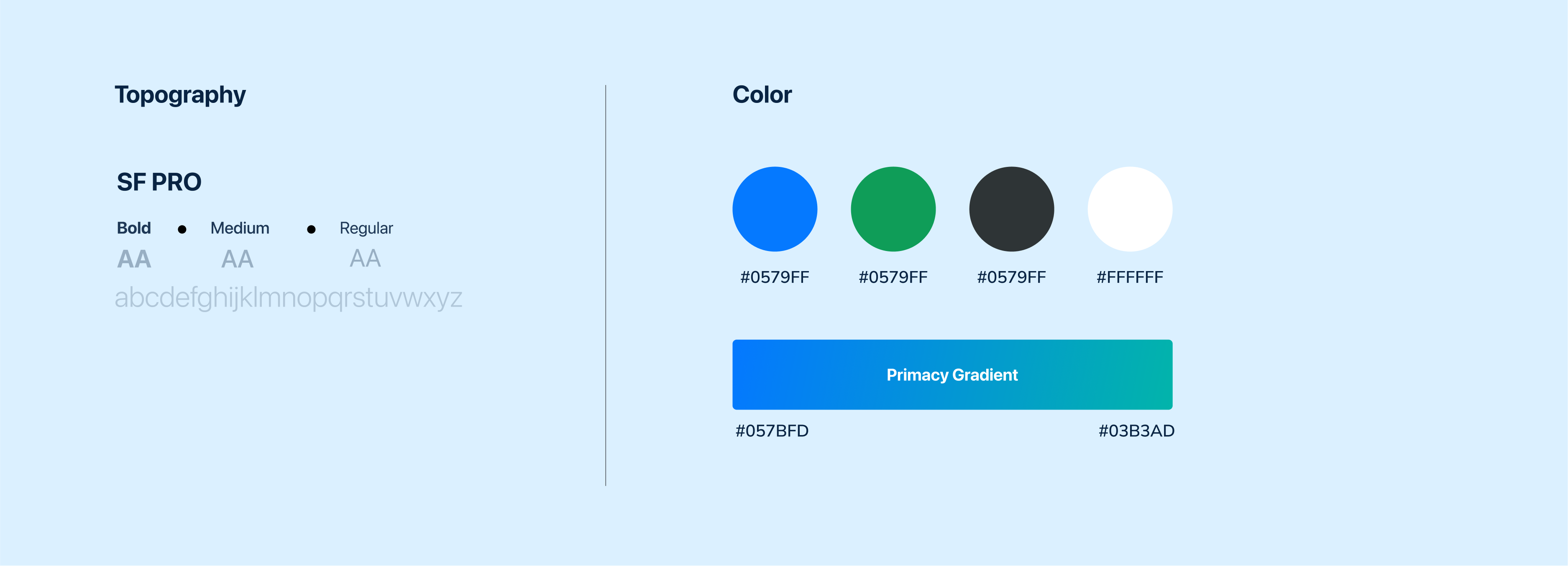



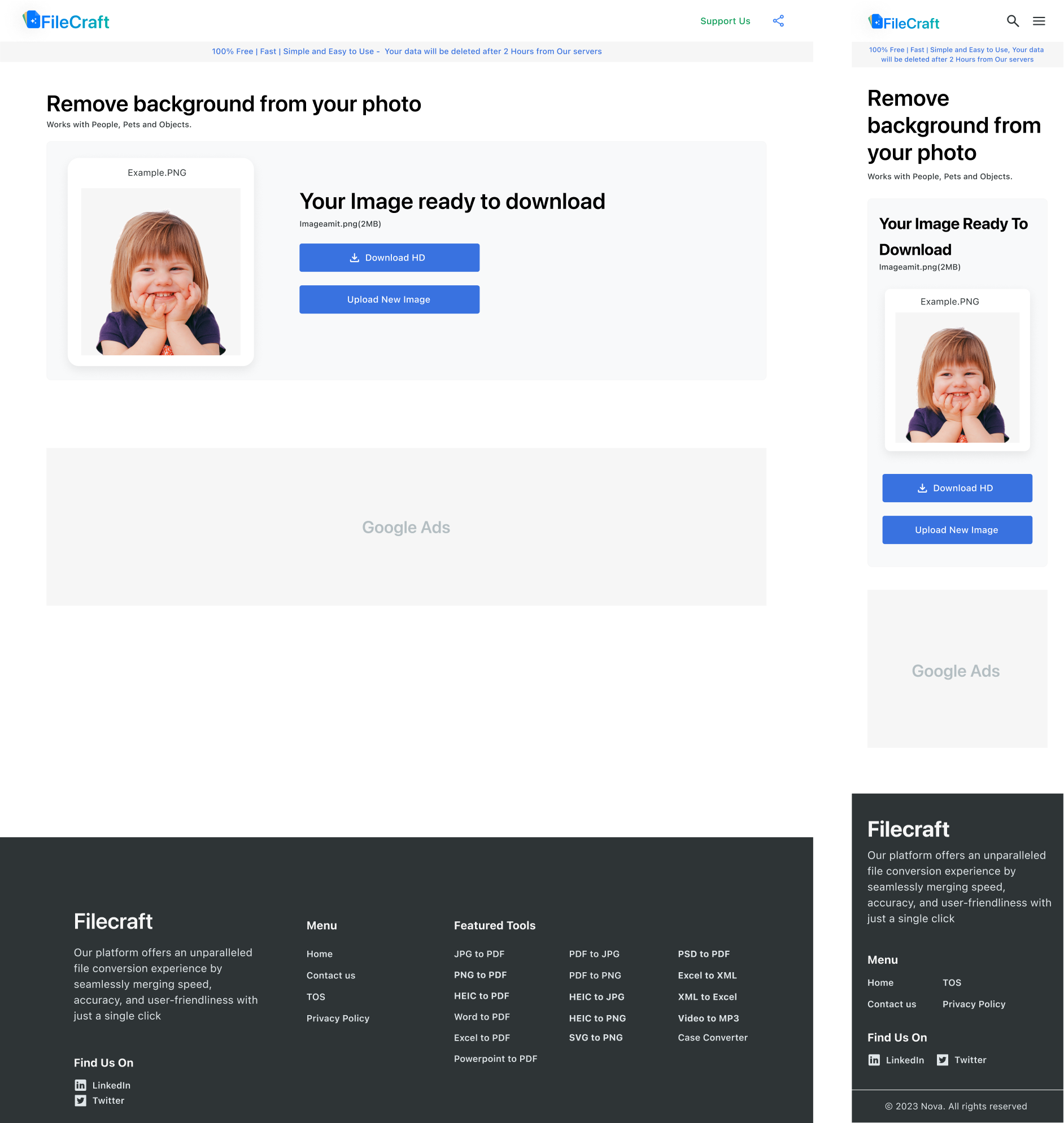

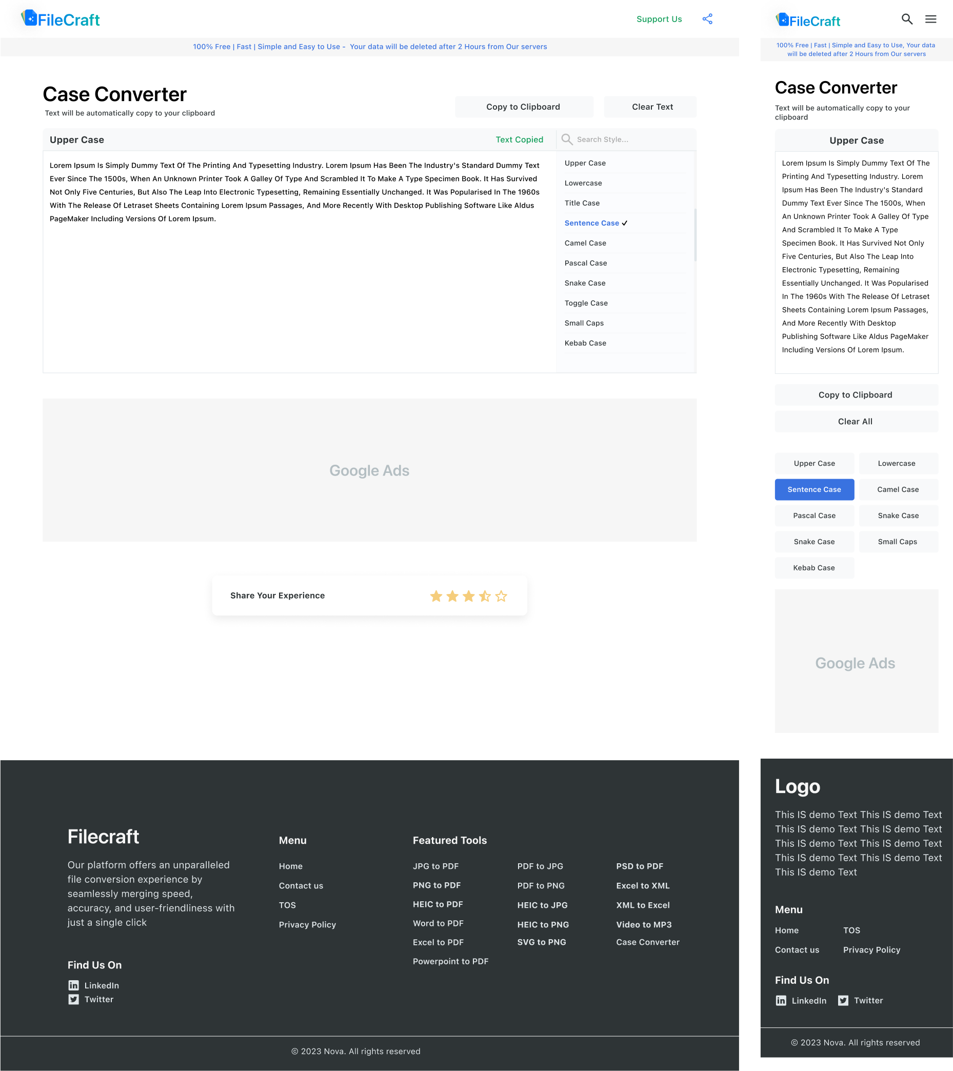


The design system project turned out to be very successful and is currently in use. As this was the first version, we’ve made several improvements since its initial creation, enhancing its functionality and design significantly. For now, I only have the rights to showcase the design system itself in my portfolio, not the entire UI or any specific pages. This foundational work has set a strong precedent for further development and application within the project.